Wednesday, November 18, 2009

Half Dose #71: Grand Teton National Park Discovery and Visitor Center

Completed in the summer of 2007, the Grand Teton National Park Discovery and Visitor Center -- officially the Craig Thomas Discovery and Visitor Center -- by Bohlin Cywinski Jackson still racks up the awards, most recently a 2009 AIA Seattle Honor Award and a 2009 Western Red Cedar Architectural Design award. It's easy to see why in the playful yet restrained design that echoes the surrounding mountains of northwest Wyoming.

HD71a.jpg
[photo by Nic Lehoux]

When I think of a national park visitor center the one overlooking Mount Rushmore, as portrayed in Alfred Hitchcock's North By Northwest, comes to mind, mainly because I've never been to a national park appointed with such a building. I'm not sure if the cafeteria in the visitor center in the film is modeled on the real thing, but a few things come across in the film set: a spacious interior, a modern/rustic aesthetic, and expansive views of Mount Rushmore. The Grand Teton Visitor Center has all these qualities, though its view is much less focused than the North Dakota landmark.

HD71b.jpg
[photo by Nic Lehoux]

The main parti of the design is a U-shape that creates an intimate outdoor space and opens up a large perimeter of windows to the mountain views to the north. Services and other ancillary spaces are located on the east and west (an auditorium addition is planned for the west side), leaving the central spaces open with generous light from the south-facing courtyard. [floor plan]

HD71c.jpg
[sketch and plan by Bohlin Cywinski Jackson]

Further, the sloping section means the north-facing glazing is taller than the exterior walls facing the courtyard. This may seem at odds with the particularly cold Wyoming winters, but it serves more of a symbolic than a practical purpose: the slope and expanse of glass open up the building towards the mountains while the serrated plan echoes their rugged topography.

HD71f.jpg
[photo by Nic Lehoux | sketch by Bohlin Cywinski Jackson]

In terms of appearances, the building brings to mind the phrase "extreme vernacular," in the sense of "to the extreme!" The Visitor Center recalls traditional wood buildings -- mostly in the courtyard and solid east-west ends -- but it departs sharply from the vernacular by combining the sloping roofs with a highly irregular plan and large expanses of glass.

HD71d.jpg
HD71e.jpg
[photos by Nic Lehoux]

Even the tree-trunk columns and beams depart from any traditional role in the selective use of them: they are not continuous, only used in an upside-down U-formation when needed at varying angles that echo the exterior wall but do not follow them precisely.

HD71g.jpg
[photo by Nic Lehoux]

This last photograph clearly illustrates the expansive views captured with the 30-foot (9-meter) high glass walls. In this large space the Discovery displays get a little lost; I can see people quickly gravitating to the glass walls and benches past them. Remembering North by Northwest, I can see a lovely cafeteria in this space.

"This Means Something!"

http://alethakuschan.files.wordpress.com/2008/05/dreyfus-without-the-mashed-potatoes.jpg
"I figured it out, that's all. Will you just listen?... Have you ever looked at something and it's crazy, and then you looked at it in another way and it's not crazy at all?... Don't be scared. Just don't be scared. I feel really good. Everything's gonna be all right. I haven't felt this good in years."

I watched Close Encounters of the Third Kind again the other day. It's a fabulous film in many ways, imbued with an almost lyrical technological optimism. Despite coming from a golden age of cinematic science-fiction, it's completely different in tone to anything else from the period. While Star Wars, for example, can be read as an allegory for the Cold War and America's struggle against another Evil Empire, Close Encounters is a plea for tolerance and understanding. Even the military appear relatively benign in it.

https://blogger.googleusercontent.com/img/b/R29vZ2xl/AVvXsEhmyzyjiQwIzeCJ-1xeRF6IyfuLNMkIiJpdclxvZB-CHf38Gpe87FXRSfJ-3gHk0xeUwpAkC0vr37-92MPi4ib1Gek-otnjwqTYyEk4_l7yITuTHI2mmQpvzt4sK419ewodLSOHklcbQG2H/s320/Apicella+Hitchcock+The+Pathos+of+Richard+Dreyfus.jpg

It can also be seen as having another, more unlikely, sub-text; one about issues of representation and communication. The film's central character is Roy Neary (played by Richard Dreyfus). Following a close encounter with an alien spaceship Roy becomes obsessed with visions of a strange, mountainous formation. He notices this shape everywhere: in the folds of his pillows, in the blob of aftershave in his hand and in a mound of mashed potatoes on his plate.

http://www.ugo.com/movies/creation-scenes/images/entries/close-encounters-of-the-third-kind.jpg

He starts to create maquettes of it in clay which become ever larger and more elaborate. Eventually, having alienated his entire family to the point where they move out, he creates an enormous model that fills his entire house. To make this model he ransacks the garden for materials, chucking them through a broken window into the living room to the horrified bemusement of his neighbours.

The resulting model is an utterly fabulous object, a grotesque assemblage of mud, vegetation, rubble, furniture and bits of string. It is both mimetically accurate (as we and Roy will later find out) and highly expressionistic, as if created by a bizarre hybrid of Robert Smithson, Jessica Stockholder and an acid-crazed model railway enthusiast.

Just as Roy is nearing the completion of this extraordinary object he realises what it means. The TV that he has blaring in the corner of the otherwise devastated living room has a news report about a bizarre shaped rocky outcrop in Wyoming. Roy looks at the footage of Devil's Tower and then back at his creation. He sits down in shock.

http://www.filmsquish.com/guts/files/images/3rd%201.jpg

In some senses Roy is like a typically Hollywood-ian depiction of the artist: a half-crazed, anti-social lunatic in search of some intangible truth. Except he isn't an artist. Nor is he mad, just a little intense. And the film also wants us to take him seriously. His sculpture, as he repeatedly explains whist making it, really does mean something.

http://dvdmedia.ign.com/dvd/image/article/838/838392/close-encounters-of-the-third-kind-30th-anniversary-ultimate-edition-20071128021143639-000.jpg

The film is obsessed with issues of representation and non-verbal communication. The famous five-note score that the scientists use to communicate with the aliens, for example, effectively replaces speech. The chief scientist is a Frenchman (played by film director François Truffaut) who makes no more than one or two gnomic utterances and is accompanied throughout the film by an ineffectual translator. The fact that none of the Americans can understand him seems to imbue him with some special understanding of what is going on.

Roy can't communicate his obsession through conventional language and is forced into non-verbal communication. He has to make what he is thinking in order to express it. And he's not alone in his obsession. Another character - Gillian Guiler - is also obsessed with Devil's Tower. She draws it over and over again. In a brilliant scene the two of them converge on Devil's Tower aware that it's the location for the alien spaceship's landing. Trying to work out how to scale the mountain Roy reveals that his knowledge of its topography is vastly superior to Gillian's. "You should try sculpture next time", he deadpans.

In making a plea for tolerance the film also seems to implicitly reject language, as if our primary means of communication were somehow ultimately a handicap to understanding. Language seems to dissolve during the film, becoming ever more useless until it dissipates into the abstract lights and sounds used by the scientists to communicate to the aliens. It is, in many ways, an anti-logocentric film, a celebration of the non-verbal and the techno-haptic.

http://listverse.files.wordpress.com/2009/01/close-encounters-of-the-third-kind-4-tm1.jpg

Refuge

[Image: Photo by Bas Princen, from Five Cities Portfolio].

Photographer Bas Princen has a new book out, Five Cities Portfolio: Amman, Beirut, Cairo, Dubai, Istanbul, coinciding with a conference to be held this Friday, November 20, at the Netherlands Architecture Institute.

That event, called "Refuge: Architectural Propositions for Unbound Spaces," will feature—among many other things—a presentation by Philipp Misselwitz and Can Altay, whose research accompanies (and seems to have at least partially inspired) Princen's photos.

[Images: Photos by Bas Princen, from Five Cities Portfolio].

About the conference:
    "Refuge" explores the causes and spatial impact of migration through voluntary or involuntary "refugees" who are transforming cities around the globe. Individuals or groups are elegantly or forcefully encapsulated from within the context of the city and society. Refuge produces an ever more atomized urban tissue where the "camp" has become both spatial paradigm and everyday reality, be it in the form of a gated community, slum, or humanitarian refugee camp.
You can check out the conference schedule in this PDF—in which you will also see that there is a release party this week for the new issue of Pedro Gadanho's Beyond, as well as a lecture by Eyal Weizman.

More of Princen's work can be found at Icon magazine, meanwhile, and an interesting interview with Princen was published in Oase #76 last year.

Salt Space / Biospeleology

The previous post reminded me of a news item reported roughly two weeks ago, that the town of Carlsbad, NM, is in danger of collapsing into the earth below due to the out-of-control dissolution of underground salt deposits.

[Image: An otherwise unrelated photograph of a house radically subsiding; courtesy of NOAA].

"The cavern was formed over three decades," the AP writes, "as oil field service companies pumped fresh water into a salt layer more than 400 feet below the surface and extracted several million barrels of brine to help with drilling... Over the past few decades, communities in Texas, Kansas, Michigan, Canada and Europe learned of similar underground danger only after cracks appeared and the ground began to sink." Unsurprisingly, then, "this man-made salt cavern has residents nervous."

It's interesting to point out, however, that Carlsbad, NM, is, of course, home to Carlsbad Caverns—making this delirious salt cave a kind of upstart simulacrum, a replicant geology intent on asserting its prominence over the natural formations nearby. We will be assaulted by copies from below.

But I mention this here because of the idea that Carlsbad could easily become the setting of some future variant of Sigizmund Krzhizhanovsky's story "Quadraturin," mentioned previously, in which the fabled room-expanding substance is accidentally deployed underground, deep-injected in an act of misguided chemical sequestration, only to form vast and endlessly self-expanding caverns miles below the earth's surface.

Unpredictably fractal and resistant to all known forms of cartography—perhaps it could even be a Mandelbulb—these weirdly life-like systems of space coil and surge through bedrock, threatening to destroy all those who live above. Living space, crawling through geology.

(Thanks to Steve Silberman for the tip!)

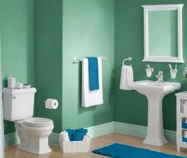
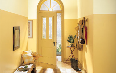
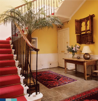
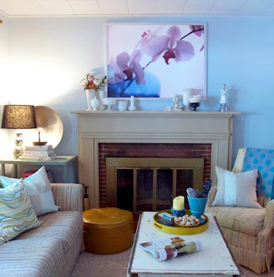
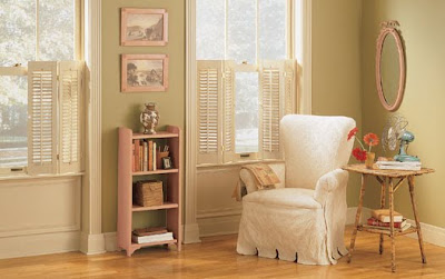
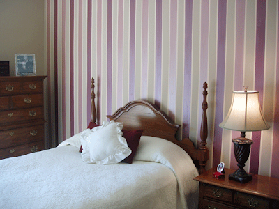
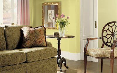
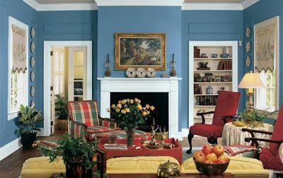
Room Painting Ideas - 32 Pics

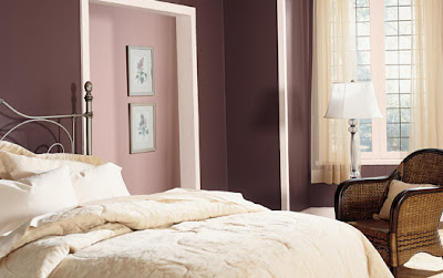
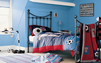
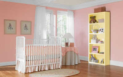
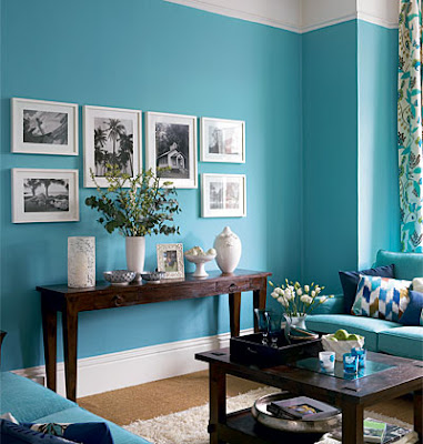
Beautiful colour combinations for your room paintings.
While most of us may not spend a lot of time thinking about color, it affects every day of our lives. Color can influence our mood and our thoughts. Colors affect people in many ways, depending upon one’s age, gender, ethnic background or local climate. Certain colors or groups of colors tend to get a similar reaction from most people - the overall difference being in the shade or tones used. So it’s important to choose wisely.
room painting ideas

room painting ideas
room painting ideas
room painting ideas
room painting ideas
room painting ideas
room painting ideas
room painting ideas
room painting ideas
room painting ideas
room painting ideas
room painting ideas
room painting ideas
room painting ideas
room painting ideas
room painting ideas
room painting ideas
room painting ideas
room painting ideas
room painting ideas
room painting ideas
room painting ideas
room painting ideas
room painting ideas
room painting ideas
room painting ideas
room painting ideas
room painting ideas
room painting ideas
room painting ideas
room painting ideas
room painting ideas